
Designing the Expedition:The Antarctic Challenge
-
Branding / Identity Design
Logo Design
Typography
UI Design
Web Design
Social Media
This client is heavily involved in the TV production realm, handling a diverse array of tasks such as crafting various print and digital marketing materials, as well as orchestrating social media and email campaigns for significant shows. When it comes to new productions, they often develop distinctive identities and branding strategies rooted in the show's content, aiding in narrative storytelling throughout these promotional efforts.
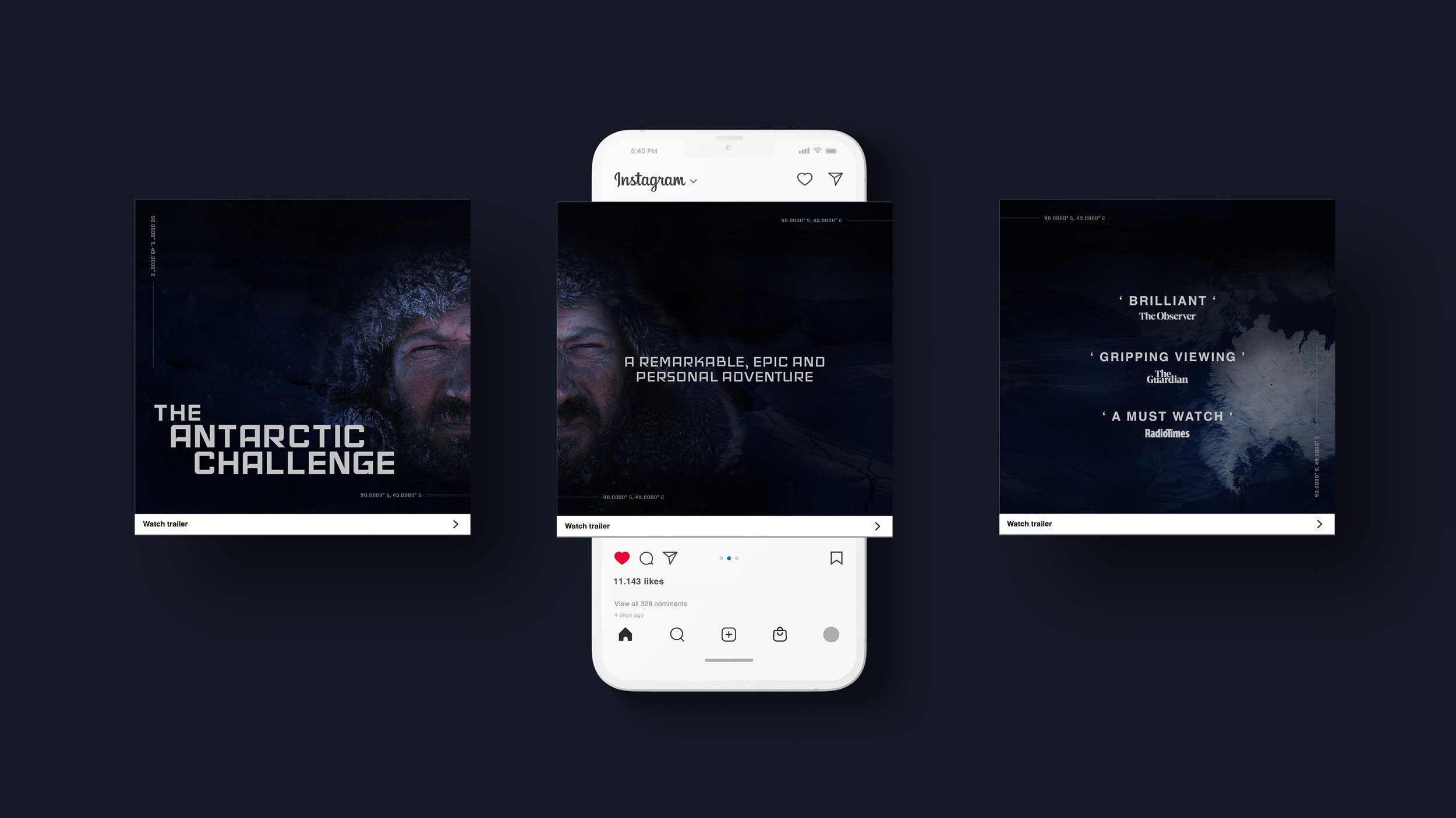
One of their projects, 'The Antarctic Challenge', is a documentary recounting an Antarctic expedition coinciding with the centenary of Amundsen and Scott’s historic journey to the South Pole, produced several years back. The task at hand was to design a Sell Sheet as a single webpage, and Social Media asset as apart of a wider campaign, for this particular show. This entailed creating a suitable logo and brand identity based on what the show is about.


The word map helped develop the branding style. Daring, tense and powerful are the three key words to reflect the journey of this documentary, it provokes these feelings and emotions.
Some elements and principles used to convey this style, sharp lines and edges, sans serif bold fonts, moody images, dark colour palette, wide unobstructed background images, large spacing.

Clean Lines,
Harsh Climates:
The Identity of The Antarctic Challenge.
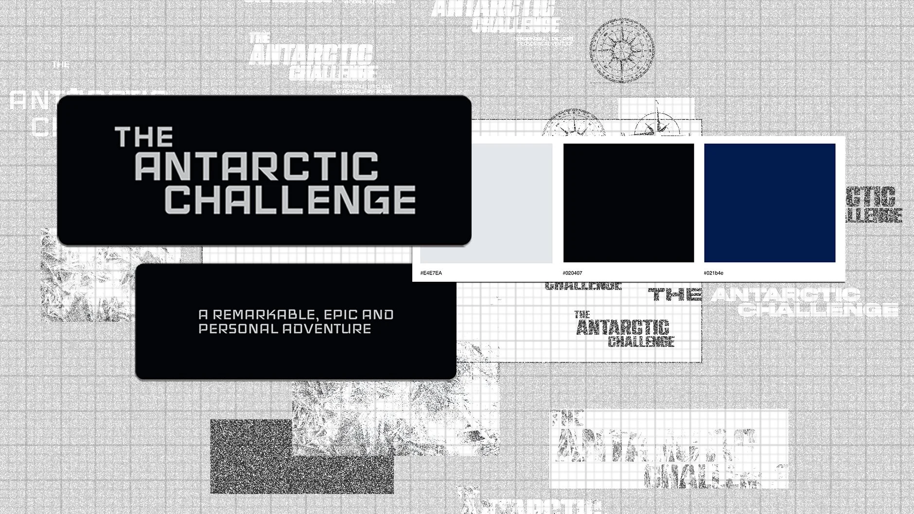
Inspiration is drawn from the harsh, icy environment of Antarctica, delivering a bold and modern look rooted in narrative and atmosphere. The logo is a customised version of the 'Iceland' typeface, with geometric, sans-serif letterforms and sharp cutouts that resemble icicles — symbolising the cold, challenging nature of the expedition. The design is clean, structured, and visually powerful, echoing the strength and isolation of the journey.
A dark, ice-toned colour palette supports the tone of the documentary. White is used for text and logos to ensure strong contrast and readability, while deep blue and black form the backdrop, creating a dramatic, cinematic feel. Light grey adds a subtle softness for balance.
For supporting text, Helvetica was chosen for its clarity, legibility, and modern feel. Bold for headings and Regular for body copy, ensuring the design remains clean and readable across digital formats. Together, these elements form a cohesive identity that visually communicates the documentary’s epic, personal, and high-stakes tone.

Wireframes and Feedback
Lo-fi, mid-fi, and hi-fi wireframes were developed for the single webpage of the Sell Sheet, with each stage incorporating feedback to refine the information hierarchy. For the Sell Sheet, I researched and identified the key details to emphasise. During the feedback process, it was recommended that the statistics be more prominently displayed early on, as they effectively highlight the documentary's success.
A favoured feature was the large hero image, which fades into the background to create a sense of suspense. Additionally, placing the Antarctic coordinates on the side enhanced the adventurous and exploratory feel while also helping to frame and organise the information for easier readability.


Design on the Edge
The visual identity for The Antarctic Challenge distills the raw essence of one of Earth’s most unforgiving environments into a clean, cinematic design system. With a customised, icicle-inspired logotype, an icy dark palette, and precise typography choices, the identity reflects both the stark isolation and inner strength of the expedition. Every element was designed to support the documentary’s epic and personal tone — where minimalism meets extremity, and silence speaks volumes.