
Fostering Connection,
the Wellbee Way
-
UX Design
UI Design
Mobile App Design
Branding / Identity Design
Logo Design
Typography
Wellbee is a social media app designed for young people living in Wellington. Its main goal is to foster connection and encourage the use of local outdoor spaces and recreational facilities. The app is interactive and engaging, showcasing fun ways to enjoy these spaces — whether solo or with friends.
A key feature of Wellbee is its focus on social connection and outdoor activity as tools to support mental wellbeing, especially in the wake of COVID-19. We've designed the app to be a positive, uplifting experience that promotes healthier habits and stronger community connections among youth.

Tapping Into Youth: What They Need, Want and Avoid
Research Goals
Find out how often young people in Wellington connect with others and spend time outdoors.
Understand why some young people don’t use local outdoor spaces or facilities.
Learn what features would make the app more helpful and fun to use.
Discover what stops young people from going outside or being active.
Explore what could motivate young people to get outdoors and connect with others more often.

Mental Health & Nature
Online research reinforced the positive link between outdoor time and mental wellbeing, emphasizing the value of green spaces and nature for both mental and physical health.
High Daily Phone Use
The target audience spends 5–8 hours daily on their phones, making a mobile app a highly accessible tool.
Social Influence Is Key
A consistent motivator for going outdoors is seeing friends post about it on social media.
Outdoor Time is Prioritised
The assumption that young people are too busy to go outdoors was disproved. Most make time for a mix of active (e.g. hiking) and relaxed (e.g. painting) outdoor activities.
Comfortable Alone or With Others
Youth enjoy being outdoors both individually and socially—being alone in nature isn’t seen as awkward or uncomfortable.
Desired App Features
Most requested features include:
Direct messaging
A news feed showing friends’ posts/photos
Additional ideas included achievements, profile customisation, statuses, videos, reminders, and social media integration.
User Surveys
User Interviews
UI Analysis
SWOT Analysis
User Card Testing
User Flow
Interviewee 1
“If the app shows what my friends are up to, I’d definitely check it more.”
Research Finding
Apps create the potential for users to compare themselves with ‘likes’ and ‘follower’ count which can negatively impact mental health.
Buzzing with Purpose: The Look and Feel
of Wellbee
Wellbee’s visual identity is bold, friendly, and deeply connected to Wellington. The logo blends themes of wellbeing and community, featuring a bee made from heart shapes — symbolising care, connection, and the spirit of Wellington. It also nods to the Beehive, the city’s iconic government building, reinforcing a sense of local identity and unity. The vibrant yellow and deep blue palette sparks energy and trust, while black and grey tones ensure clarity and inclusivity. Modern, clean typography keeps the experience warm, readable, and approachable — perfectly reflecting Wellbee’s uplifting purpose.


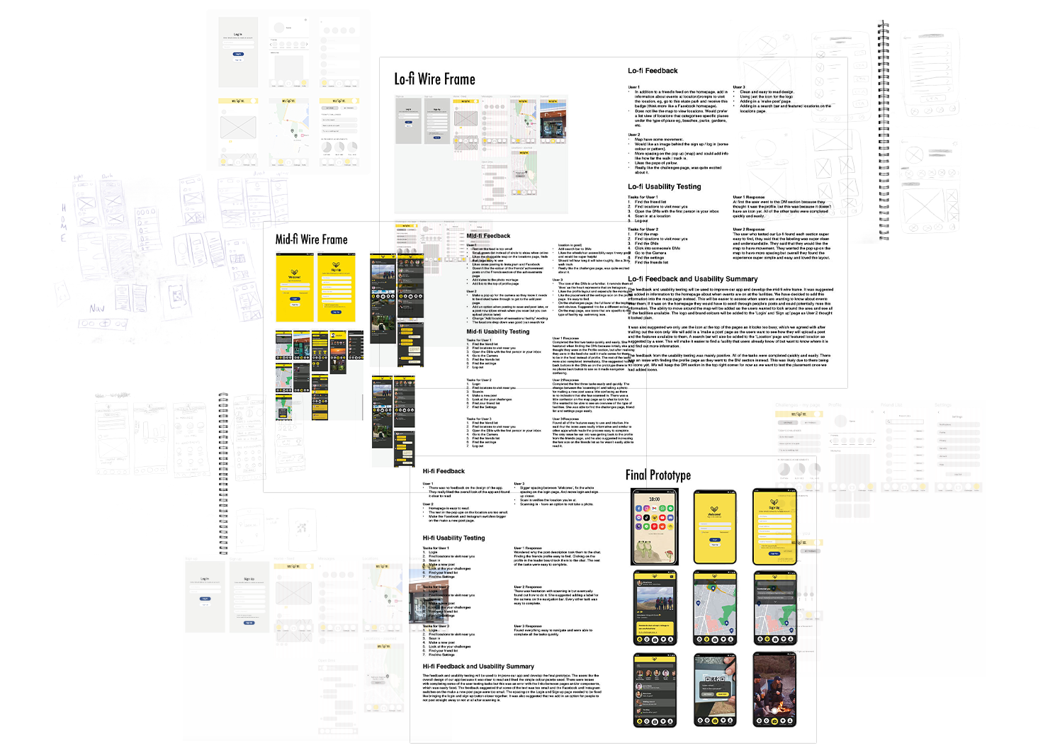
Lo-fi Wireframe
User feedback led to several improvements. Event info will be shown on the map page instead of the homepage for easier access, and the map will become interactive. The login/signup screens will include branding, and top navigation will be simplified with icons only. New features include a “Make a Post” page and a search bar on the Locations page. Testing was mostly positive. One issue was users confusing the Profile and DM pages — likely due to missing icons.
Mid-fi Wireframe
Some users were confused about the camera, so we’ll make it clearer when it’s for scanning versus taking a photo. The logout button will stay in Settings, as most users preferred this. “Add location of recreational facility” will be shortened to “Add location” for clarity. We’ll add a search bar to the DMs page, challenge prompts to the homepage, and a save-for-later option when posting. Map icons will be updated to match different facility types, like swimming or gardens, to make them easier to find.
Other small changes include larger font sizes, a green dot for online status, dates on photo montages, profile bios, and a back arrow on the Friends List page. Most tasks were completed easily, but some users struggled with DMs and the map. These will be improved in the hi-fi version with clearer labels and navigation.
Hi-fi Wireframe
Users liked the clean design and simple colour palette. Some issues during testing were due to broken links between pages, which were easy to fix. Suggestions included increasing text size, making the social media switches more visible on the post page, improving spacing on the login/signup screen, and adding an option to skip or delay posting after scanning in. This user feedback will help improve the app and shape the final prototype.
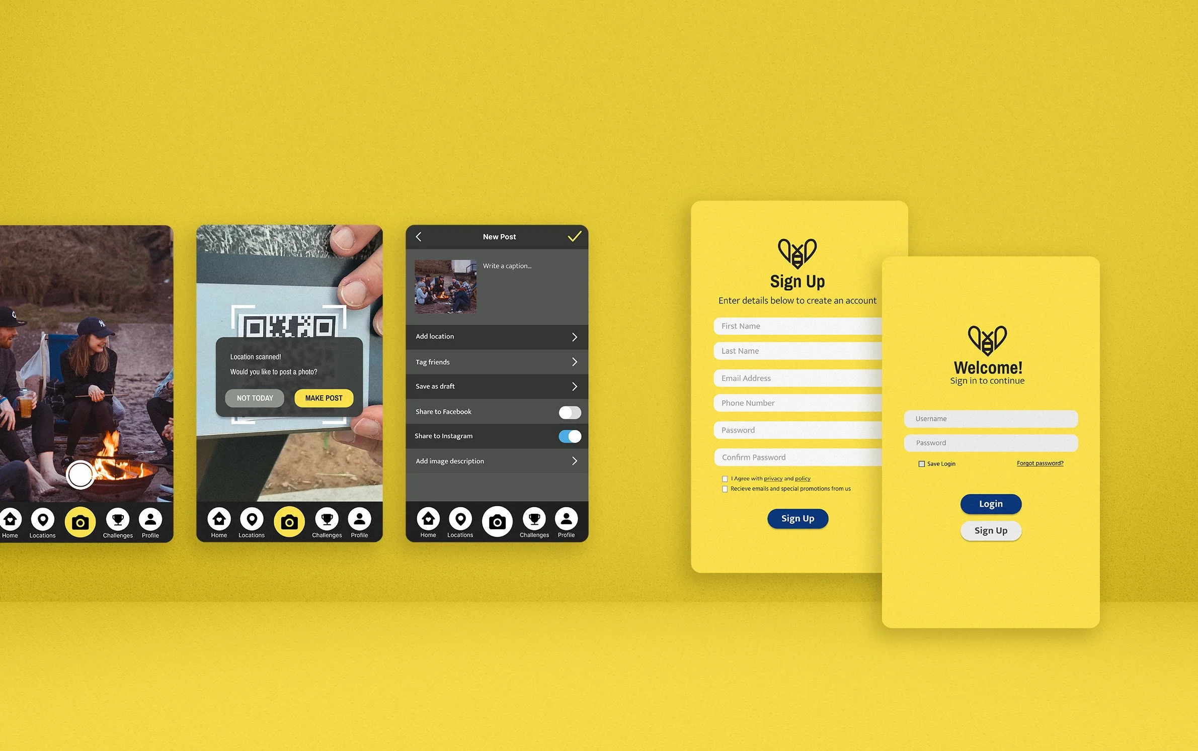
From Prototype
to Possibility
The Wellbee prototype was designed to simulate key features and ensure a smooth, engaging user experience. We conducted multiple rounds of user testing to refine functionality, icon clarity, and overall usability.
Familiar UI patterns inspired by social media apps made navigation intuitive, while clear system feedback—like interactive icons and loading screens — kept users informed. Accessibility was prioritised through colourblind-friendly design, readable fonts, and dark mode to reduce eye strain.
We implemented strong privacy and safety measures, including a private friend system and minimal data collection. To support mental wellbeing, features like likes and friend counts were removed to avoid social comparison.
Future improvements include motivational notifications, reels, facility filters, and a light/dark mode toggle — all informed by user feedback.