
Less Guess, More Green: Core’s Smart Composting Solution
-
UX Design
UI Design
Mobile App Design
Branding / Identity Design
Logo Design
Typography
Core, is a smart e-bin designed to simplify home composting, with the slogan “The core for composting.” Core takes the hassle out of composting by automating the process, making it accessible even to users with little to no composting knowledge.
Paired with an app, users can track compost health, receive step-by-step guidance, and get notified when their compost is ready. The bin features built-in sensors to monitor carbon, nitrogen, oxygen, and moisture levels, and includes an automated turning system to keep the compost healthy with
minimal effort.

Overwhelmed by
Organic Waste?
We Asked Why.
Research Goals
Identify and measure the level of home composting among area households.
Investigate reasons for not composting.
Understand what functions could benefit people
who compost
Examine ways to remove barriers to increased
home composting.
Explore incentives to increase home composting
User Surveys
User Interviews
UI Analysis
SWOT Analysis
User Card Testing
User Flow
What Users Want: Smarter,
Simpler Composting
The survey revealed strong interest in smart composting solutions, especially when paired with an app that offers compost health tracking, general instructions, and notifications when compost is ready. Respondents valued features such as automated turning, sensors for monitoring carbon, nitrogen, oxygen, and moisture levels, and an easy-to-read composting guide.
Messy Bins, Clear Needs: Composting from the User’s Perspective
Interviews showed that most participants compost to reduce waste and are generally confident about what can be composted. However, they still face challenges such as moisture control, forgetting to turn the compost, physical difficulty aerating, and occasional confusion over compostable items.
There was strong interest in a smart compost bin, particularly if it could automate unpleasant or laborious tasks like turning the heap and collecting finished compost. Many users also expressed interest in an app that could clarify what can be composted, track progress, and provide helpful notifications. Some users, like Cheyenne, preferred maintaining a manual connection with the composting process and wouldn’t want full automation.
Designing with Nature in Mind
Analysis of similar environmental and educational apps revealed common visual patterns: nature-inspired colour palettes (especially greens and creams), the use of organic shapes, rounded icons, and soft UI elements. These apps typically feature clear buttons, well-placed navigation (often at the bottom), and intuitive user flows. However, many lacked clear labeling, which is a consideration for future UI design.
Smart, But at What Cost?
SWOT Analysis was done between two smart bins. Both Lomi and
Bin-e offer innovative composting and waste management features such as automated operation, composting speed, real-time notifications, and clean, user-friendly design.
However, key drawbacks include high cost and the need for ongoing maintenance. Lomi, for instance, must be maintained every 3–6 months, and both systems are seen as expensive despite their smart features
Visualising the
Core Idea
The visual identity for the Core app centers around a clean, nature-inspired design that blends simplicity with meaning. The logo features a clever combination of a leaf and an apple core, visually reinforcing the app’s focus on organic waste and sustainability. Rendered in an earthy olive green, the logo evokes a sense of eco-consciousness and calm, aligning with the composting theme.
The word-mark uses a bold, rounded sans-serif font, giving it a modern and approachable feel that reflects the app’s goal of making composting easy and user-friendly. The icon is versatile, working well both on its own and alongside the text, and is adaptable across various applications—from app icons to product branding — while maintaining its clear, cohesive identity.


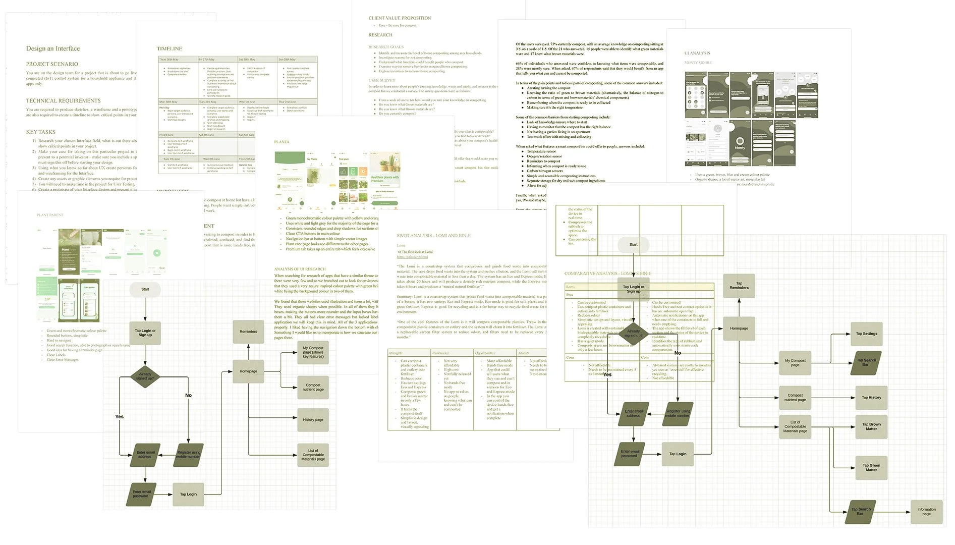
Lo-fi Wireframe
Users found the app clear, easy to use, and well laid out. They suggested tightening the spacing between the Sign Up and Login buttons, adding labels to nav icons, and explaining composting terms like “green” and “brown matter” for clarity.
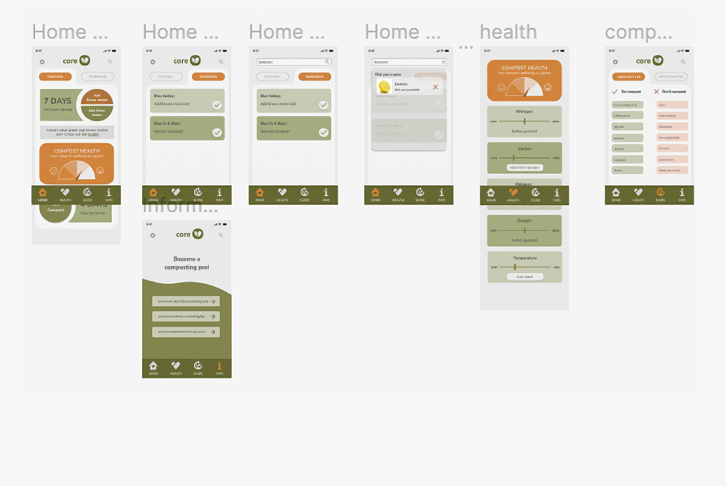
Mid-fi Wireframe
Users liked the earthy colour palette but found it too muted, making key elements hard to spot. Buttons weren’t always recognisable, and the compost health page lacked visual clarity. The compostables page was confusing — users preferred a simple “do and don’t” list. They also suggested clearer labels, more icons, and a colour scheme that better reflects composting. The login flow was well received, and users were keen to see a settings page and working checkboxes in the
next version.
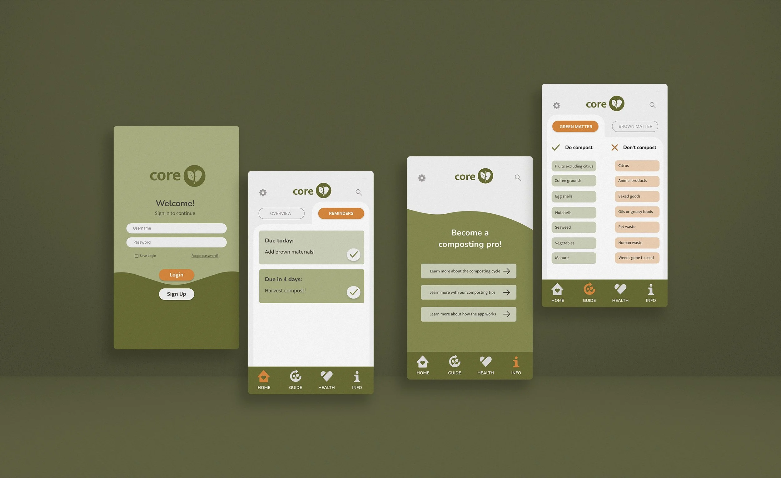
Hi-fi Wireframe
The hi-fi version got strong praise for better usability and visual appeal. Users liked the intuitive green/brown “add” buttons, improved compost health bar, and vibrant, unique colour palette. The compostables list worked well, though the font felt small. Some had trouble finding the Green and Brown Matter lists — suggesting a clearer label than “Guide.” Other suggestions included reordering nav icons, unlinking the logo from the homepage, adding colour indicators for compost quality, and reducing box curves for a cleaner look.
Style Guide
I developed a reusable component library in Figma to maintain visual consistency and improve efficiency throughout Core’s wireframing and prototyping stages. The style guide included typography, colour palette, iconography, and UI elements, ensuring a cohesive user experience and supporting a smooth design-to-development handoff.

Designing the
Future of Waste
The Core prototype was designed to simulate key interface features and provide a clear vision for both stakeholders and developers. Usability and accessibility were top priorities, with consistent design choices, user testing, and error prevention features like intelligent search suggestions and sign-up validations. Visual feedback, such as loading animations and clear system status indicators, enhanced the user experience.
Accessibility was addressed through high-contrast colour choices, icon labels, and avoiding reliance on colour alone to convey meaning. The app’s clean, eco-inspired design used soft greens and oranges, rounded buttons, and organic shapes to support its environmental theme. Extensive user testing informed each design stage, with feedback driving improvements in navigation, layout, and visual clarity.
Future plans include expanding educational content and adding features like a forgotten password function. Overall, the project was successful, with strong teamwork, user-focused design, and a final product that responds directly to users’ needs for a smarter, simpler composting experience.