

Through Lou’s Lens
-
Branding/Identity Design
Logo Design
Typography
Print Design
Meet Lou Hatton - a commercial and portrait photographer based in New Zealand, with a rich creative journey shaped by five years working in the UK and France. Lou has collaborated with industry leaders such as Peter Jackson, Empire Magazine, Xero Accounting, MAC Makeup, New Zealand Tourism, and the Directors Guild, refining a bold and distinctive visual style along the way.
This project involved a complete rebrand of Lou Photography, aimed at capturing boldness, strength, and a subtle feminine touch. The new identity was designed to reflect Lou’s lively, creative personality — something joyful, expressive, and visually striking that truly mirrors her imaginative spirit behind the lens.

Told in Type
& Colour
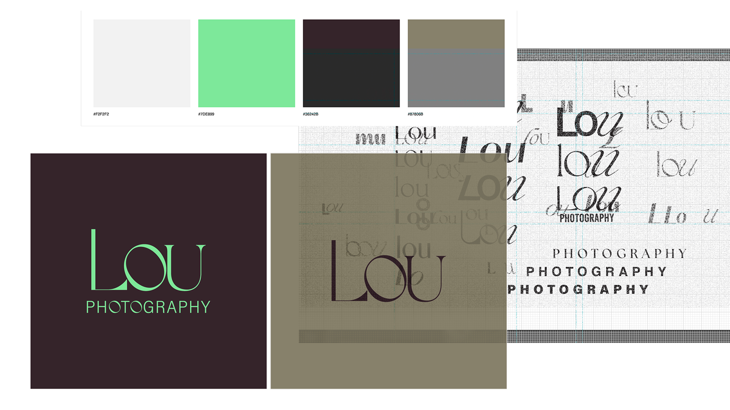
The resulting logotype uses a customised high-contrast serif typeface, balancing delicate, thin strokes with bold, impactful curves to symbolise both elegance and power. Each letter in Lou follows a consistent stylistic approach, while the “o” stands out with an inverted orientation, adding a playful, whimsical twist that reflects the client’s imaginative and expressive spirit.
To complement the main logotype, the word photography is presented in a clean, linear format, reinforcing a sense of professionalism and clarity. Yet, it subtly echoes the brand’s creativity by reintroducing the distinctive “o” from the Lou logo, tying the identity together in a cohesive and thoughtful way.
The colour palette blends soft neutrals, a fresh mint green, deep cocoa brown, and muted olive capturing the perfect balance between playful energy and grounded sophistication. The lively green injects a sense of joy and creativity, while the earthy tones provide depth and warmth, aligning seamlessly with Lou’s bold yet approachable personality.
“ I’m known for my friendly, fun, and relaxed approach, which helps everyone feel at ease, ensuring each project is a success from start to finish.”
A Viewfinder Reimagined
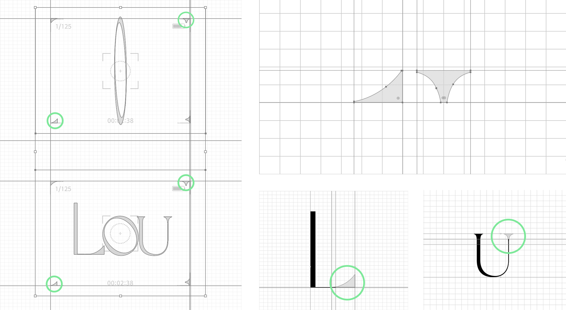
To complement Lou’s expressive identity, I designed a distinctive graphic element that could function as both a visual signature and a versatile brand tool. It can be layered over photography, used to frame copy, or act as a holding device for the logo, anchoring content while adding a sense of personality and focus.
The form is a playful reinterpretation of a camera viewfinder, reimagined to reflect Lou’s unique creative lens. Traditionally, a viewfinder represents precision, focus, and framing. Here that symbolism is given a quirky, artistic twist to mirror Lou’s imaginative perspective.
Each part of the element is crafted from pieces of the custom L, O, and U in the logotype. The circular centre is a stretched version of the “O,” inspired by the shape of a convex lens — a form that bends light toward a single focal point, much like Lou’s ability to bring clarity and emotion into focus through her work. The corner accents are derived from stylised fragments of the L and U, positioned like a traditional viewfinder grid. Two of each letterform are used, with one set mirrored to enhance the dynamic, unconventional character of the system.
The result is a brand device that feels intelligent, unexpected, and entirely Lou—blending structure and spontaneity, focus and creativity, in one cohesive
visual motif.


The Art of Being Lou
The rebrand for Lou Photography successfully captures the essence of the client’s expressive, creative spirit through a visual identity that is both refined and playful. From the high-contrast serif logotype with its whimsical inverted “o” to the considered colour palette and distinctive brand element inspired by a camera’s viewfinder, every detail has been designed to reflect Lou’s strength, individuality, and imagination.
The result is a cohesive and contemporary identity that communicates professionalism while remaining deeply personal. Balancing elegance with boldness, clarity with character, and ultimately, creating a brand that feels unmistakably Lou.