

Vision: Where Nostalgia Meets Now
-
Branding / Identity Design
Logo Design
Typography
Print Design
Illustration
Social Media Design
I was tasked with creating a brand name and identity for a hypothetical beverage company. The result was Vision — a soft drink brand crafted for a youthful, university aged audience, designed to be served in popular cafes and made with fresh, high-quality ingredients. The identity needed to strike a careful balance: it had to feel contemporary and forward-thinking while also offering a sense of comfort and familiarity.

Modern Hearts,
Vintage Souls
Today’s younger generation is deeply informed, socially conscious, and unafraid to question outdated systems. They’re actively redefining what it means to live with purpose and conviction. Yet, despite their boldness, many still experience moments of uncertainty — and in those times, nostalgia often offers a sense of comfort and grounding.
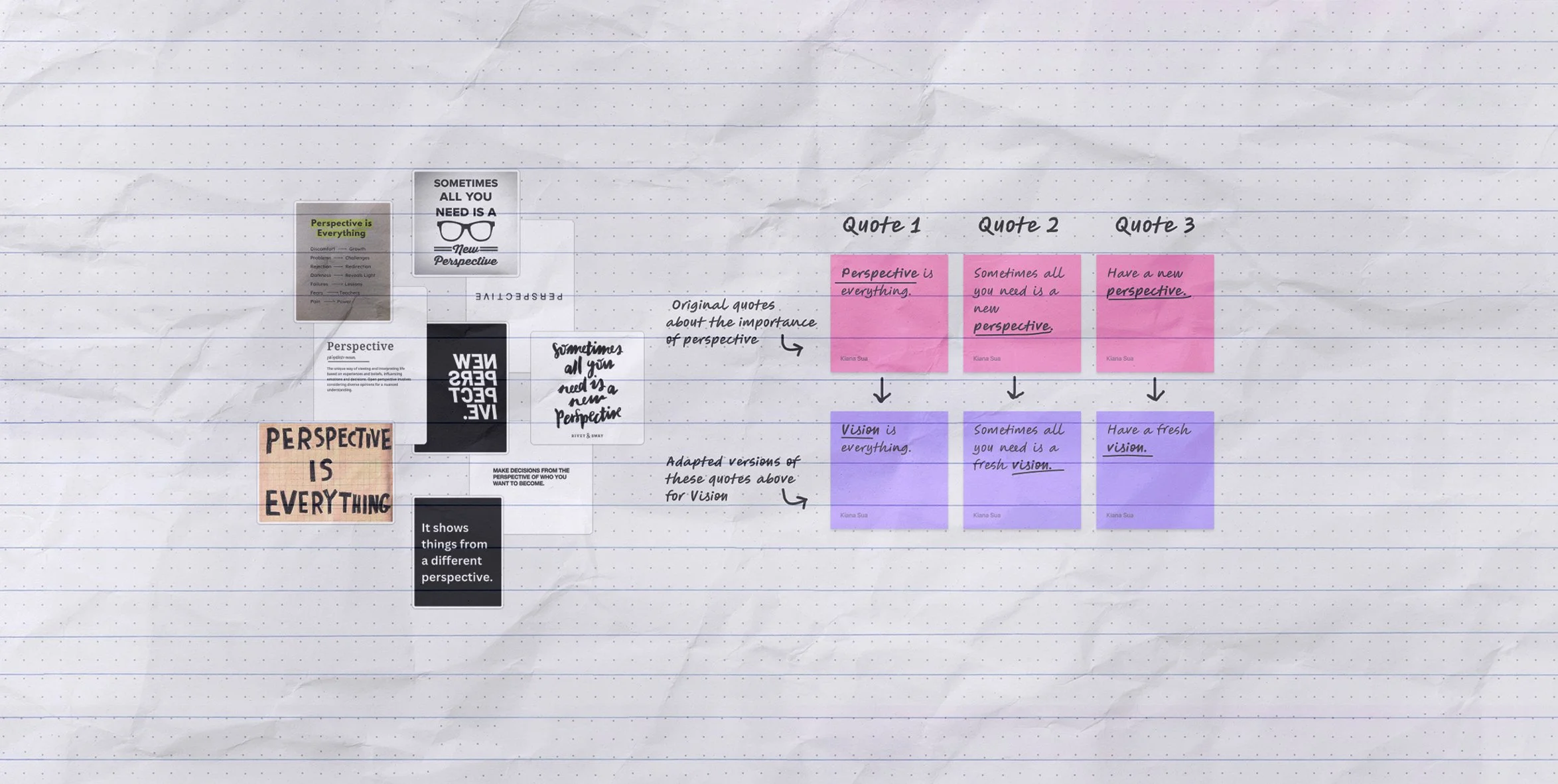
The brand name Vision was chosen to reflect this idea of perspective — a nod to the fresh, thoughtful ways young people are reshaping the world around them. The identity captures the tension between progress and sentimentality, blending modern design with nostalgic elements to express both the energy and emotional depth of today’s youth.


Identity in Play
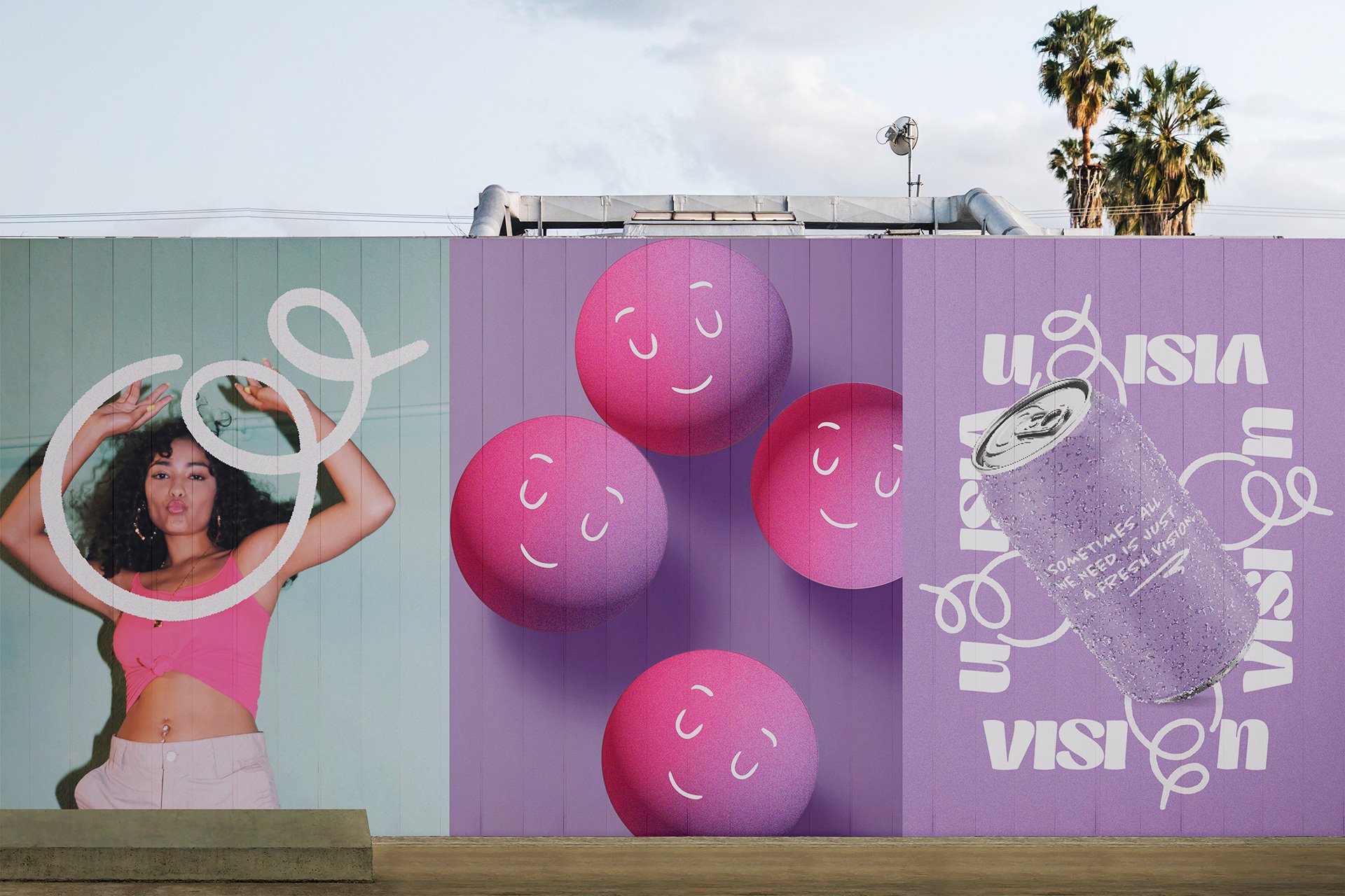
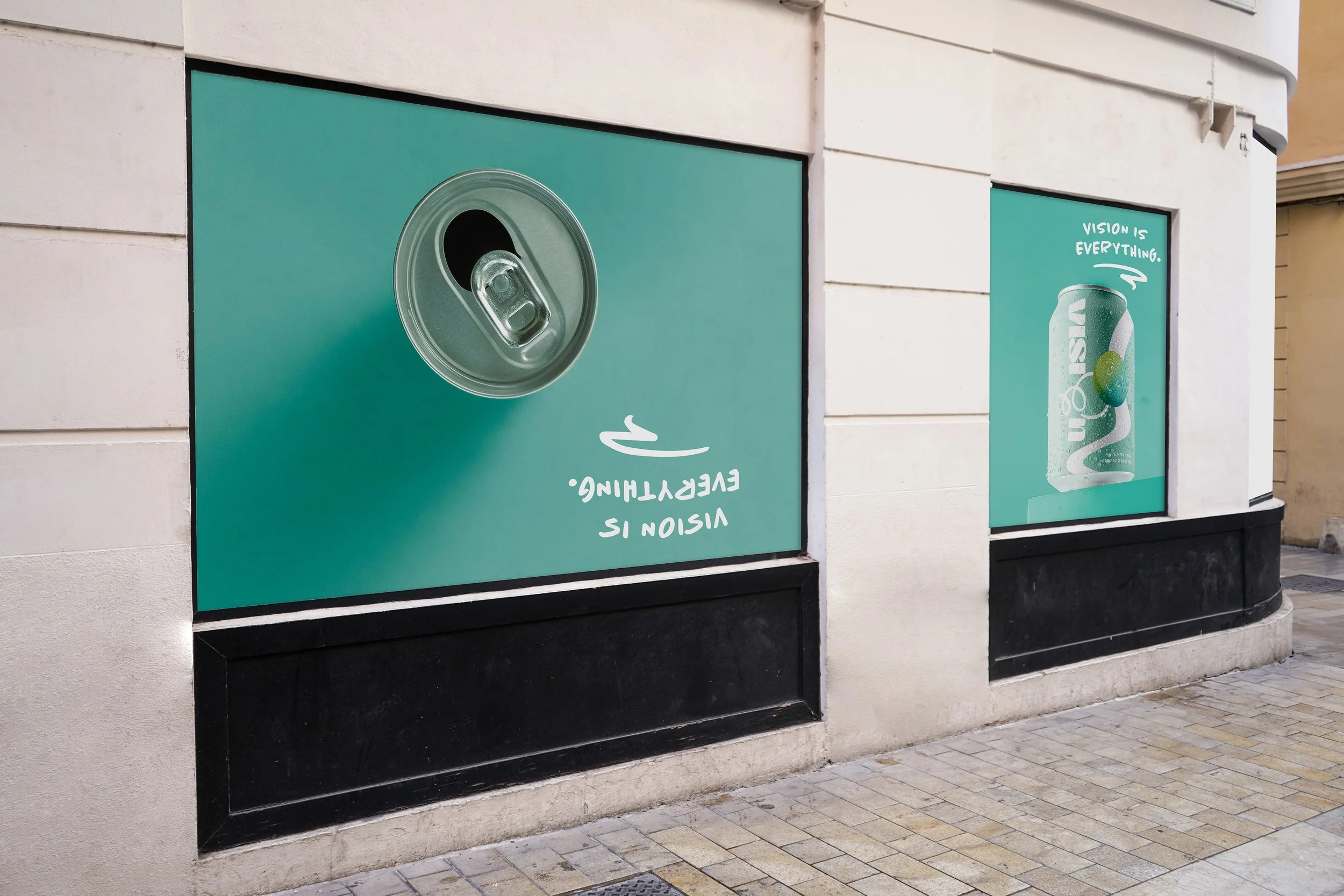
The visual identity for Vision is a thoughtful blend of modern playfulness and nostalgic charm. At the heart of the logo, the abstract 'o' subtly nods to playgrounds and childhood memories, evoking a sense of comfort and familiarity. Its form mimics the motion of a bouncing ball, symbolising the dynamic and unpredictable journey of growing up in today’s world. This concept is extended through a set of illustrated bouncy balls, each featuring calm, content facial expressions — representing the quiet resilience of youth and the inner calm Vision aims to inspire with each sip. These playful mascots also draw inspiration from vintage children's food packaging, adding a layer of retro familiarity while reinforcing the brand’s youthful spirit.
The retro-inspired colour palette, paired with clean, minimal design and generous white space, strikes a careful balance between vintage aesthetics and modern simplicity. Handwritten text and film-style imagery further enhance the nostalgic tone, adding a personal, emotive touch. While Vision is a single-flavour product, it comes in three unique packaging colours (green, purple and orange) subtly celebrating the individuality, diversity, and expressive freedom of today’s youth.
The Vision
Comes Together
Vision stands as a cohesive and emotionally resonant brand identity that captures the complexities of today’s youth — balancing boldness with vulnerability, and modernity with nostalgia. Every visual element, from the playful logo to the retro inspired packaging, is rooted in meaningful symbolism and designed with intention. By reflecting the mindset, individuality, and emotional depth of its target audience, Vision becomes more than just a soft drink. It becomes a comforting, expressive, and culturally relevant experience. The result is a brand that not only feels authentic, but leaves a lasting impression.